My simple (crude if you prefer) look at things is just my way to get a handle on things. It is based on economic bubbles.
We have had quite a few economic bubbles. No one seems to see them coming until they arrive. I have used longer term moving averages for a long time to get a handle on the economy. A five, ten or larger number of year average gives you a simple measure. If what you are betting on is above the average, it is likely to correct to below the average. The more above, the more likely the correction will be sever. It works pretty good for economic trends. Climate is different because the data is not all that great.
This is not a dig on the guys collecting the data it is just the nature of the beast. The ocean heat content is a great example. OHC depends on a lot more than surface temperature. There is a lot more going on below the surface. To confound things, it takes a very small change in temperature below the surface to have a fairly large change in OHC. The way the data for OHC has been collected changes over time. Most are biases to the surface temperature. More recently, the upper 2000 meters have been included. There is nothing simple about interpolating the older data to the newer data. The OHC therefore sucks, but that is just the way things are. So Tamino lambasting Tisdale for "Cherry Picking" what appears to be the best data is kinda funny to me.
So I started playing with some moving averages. I compared a 21 year backward looking moving average of the Hadcru data with an 11 year moving average. I could have used different time frames, I just happened to used these. While it is not very scientific, I expect the slope of these different moving average to be similar and that the R squared value of the longer moving average to be higher than the shorter moving average. The longer term is more smoothed, so there is less variation.

I also added the Dora Total Solar Irradiance (TSI) to this chart just for grins. I had to scale the TSI and the OHC data for the view I wanted. The yellow (21yma) and green (11yma) for the HADCRU are the only two I think are worth comparing since the time periods are much shorter for the other two. The scale of the Dora exaggerates the energy of the solar as directly measured, but is roughly what the impact some believe it would be with amplification of other natural factors. The correlation with solar is pretty minimal. It probably has some cyclic impact on surface temperature, but it would be pretty complicated to prove it has a significant impact (Maximum Overlap Discrete Wavelet Transform?). The 11 year moving average of the OHC shows pretty weird stuff at the start when the data is the poorest. I personally doubt there is a 10 year lag in OHC of that magnitude. I believe the data quality leaves a bit to be desired.

In this chart I dropped the Dora and chopped off the HADCRU to start with the OHC. The slope of the HADCRU moving averages changed as would be expected, but the R squared and relative slopes changed. To me this is an indication that the earlier data quality is not the same as the later data quality. There are larger adjustments made to the earlier data plus other factors. This doesn't indicate which is better or how much better (worse), just that there seems to be a difference.
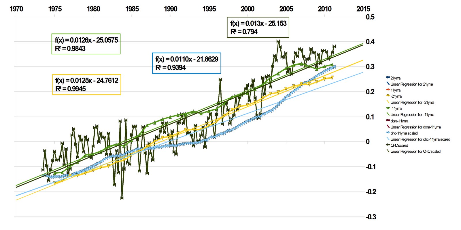
In this chart I chopped off the weird start of the OHC and the HADCRU to match. I also added the OHC quarterly data with trend. Even with the shorter time period the agreement improves between all four plots. To me this indicates an improvement in the data quality. The start time happens to be around the time that more work was started to analyze anthropogenic impact on climate.
Comparing the charts just states the obvious, the quality of measurements improve with time. So to me "cherry picking" better data is not only okay, but required if you want to learn more about things. I don't see why there is so much squawking about cherry picking if done properly.
I am curious about the 1910 to 1940 surface temperature data. Allowing for uncertainty in the data quality of the 1910 to 1940 versus the 1980 to 2010 period, there are probably clues in the comparison.
There are a good many clues that may be lost in the ridged treatment and selection of different data sets. Paleoclimate data series tend to be overly smoothed trying to dig out whatever signal there may be. "Regional" climate impacts in the past are smothered by the signal processing and weighting of series. In general, I feel that many scientists are overly confident in their results. This makes them overly sensitive to what should be constructive criticism and questions they feel they have adequately answered with older analysis. As the data improves the projections improve. More scientists should update their analysis online so we all can get a better view of the changing picture.
BTW: My methods may be crap, but the charts are looking better :)
No comments:
Post a Comment