A lot of people are spending a great deal of time trying to convince everyone that enhanced global warming is going to be a lot and bad. A lot of other people are spending a great deal of time trying to convince people it is natural and good. There are a good number of people in the middle. None is all that good at convincing anyone else, which is pretty funny. So I am positive that I can't convince anyone either. So I am not going to try. I am going to show off some of my simple plots, so maybe people can see why I think the way I do.

This first chart is the GISStemp global temperature average. There is a lot of debate about how useful GISStemp is, but it is close enough for government work. The basic trends are in the record, though the accuracy is questionable. It is considered more of the worst case temperature average. That is perfect for what I am doing. In the chart I have devide the temperature record in to 15 year periods and add a linear regression line extending to the year 2100. I chose a 15 year period because there appears to be a roughly 30 year natural climate cycle or combination of cycles. What causes these apparent cycles, I don't know, I don't care right now. They appear to exists for what ever reason. They may continue, they may not. I would guess they will continue, if so, how they are changing is a clue. The chart is pretty busy, but I wanted to show it anyway.

This is the same chart, only I cut out the temperatures from about 1950. This is considered to be the natural part of the temperature average, but that really just means that enhanced CO2 does not play much of a role. World population was less then, so land use changes should not be as much of a factor as after 1950. A lot more stuff was going on near the end of this chart, but it is a convenient break point. The chart shows a pretty good size change in the slope of each 15 year period. I want to animate this so it would be easier to see the changes. Ideally, I could step through the temperature series in 15 year periods increased by one year for each period. That would be neat, but my computer and I can't seem to get together on that.
The chart shows the climate changes pretty well and shows that the period from 1910 to 1940 had two rises back to back. Those are the green and yellow parts of the chart. The next 15 year period trended cooler.

This chart starts at the end of the last with the same 15 year cooling trend at the start. So we have a down trend, a neutral trend and three up trends. The last three up trends are pretty tightly grouped, but there is a difference in the slopes. The slope of the last period is a little less than the others. It is pretty obvious that the changes in the slopes of the 15 year periods is not as much as in the last chart of the more natural climate period. That is a pretty fair indication that something is changing, but it does not indicate what or how much all that well.
If you go back to the first chart you can see that the range of values in the year 2100 have a tight range above zero and a little more open range below zero. The interesting thing is that the range above zero pretty consistently ends up around 200, which is 2 degrees C. This is a far from perfect way to look at this. It would be better to zero each period and limit the range to 100 years for each period, but the chart is pretty useful, as is, to me. It shows there is a change, the change is definitely to the warmer and there appears to be a limit to the warming. It doe not show that the warming is mainly due to CO2.
This is the same chart with only the Northern Hemisphere. The up slopes are much greater and the changes in the up slopes for each period more pronounced.

This is the same chart for the Southern Hemisphere. The up slopes are less and while the changes in the slopes less pronounced, the light blue line is definitely positive. This is more the reaction I would expect from Enhanced CO2, but far from definitive evidence.
There are a lot of differences between the Northern and Southern hemispheres. The northern has more land mass, more people, more temperature stations and in general more stuff happening. The southern has less of everything, especially temperature data, which makes it hard to draw any solid conclusions.

This chart is using the RSS satellite data with 1979 to 1995 in red and 1995 to 2011 in green. The zero for this chart is different than the GISStemp charts. You need to add about two tenths of a degree to the end point at the year 2100.

This chart is using the RSS satellite data for the northern hemisphere with 1979 to 1995 and 1995 to 2011 trends. Same deal with the adding about 0.2 C for the difference in the zeros.
These charts are limited by the satellite coverage. The NH and SH don't have the same overall coverage, but the trends should give a decent ballpark of what is happening. The SH chart has a very flat red, 1979 to 1995 trend, this and the same period in the GISStemp chart indicates that CO2 enhancement is not as strong as advertised. It does not in any way indicate that CO2 enhancement has no effect, just that it appears to be less than advertised. The accuracy of the data is not perfect, there are natural climate variables, there are a lot of things that make a definitive conclusion impossible. When you look at the 1995 to 2011 trend, it is warming, but just like the 1979 to 1995 trend, a good deal of that could be natural. I would reason that a portion, about 50%, is enhanced by man and that in the southern hemisphere most of that enhancement is due to addition gases added to the atmosphere by man.
There is a lot of noise in the data. There is a huge difference in the way the northern hemisphere is responding versus the southern hemisphere. There is a definite indication with the GISStemp data that the natural variability before 1950 is somewhat altered after 1950. All this to me, indicates that the climate's sensitivity to man's activities is roughly 1.3 to 2.1 degrees C by 2100. A portion of that sensitivity is due to greenhouse gases, but a similar portion of that sensitivity is likely to be due to other factors, like land use and pollution.
There are a lot of things missing in a simple linear analysis. Growth is not always linear. Actually, growth has been more exponential. So a big question is if growth can continue to be exponential and if so, how much so?

This chart is pure speculation. Since 1950, world growth has been pretty intense. There are all manner of growth estimates, real growth never seems to match many of those estimates. I cannot hazard a guess who's prediction my be closest to the future reality. In the chart above I guessed that since 1950 there has been a 2.5% per year average global effective growth rate. I settled on 2.5% mainly just to keep it on the chart. In addition to the overall GISS global temperature with trend to 2100, I added the trend from 1950 to present. It dos not really mean anything, it is just an aid me to see how exponential growth MAY be related to global warming.
Different groups have built different models to predict global warming using much more sophisticated estimates of CO2 increase, land use change, etc. etc. Actual warming, especially since 2000, has fallen at the lower boundary of those estimates. In the past year, actual warming has fallen below the confidence interval of many of the modeled projections. As Yogi Berra said, "It is hard to make predictions, especially about the future." Just comparing the temperature rise from 1950 to the wild ass guess of 2.5% sustained global effective growth is higher than the impact seen globally for the same period. If I redid the chart with the Northern hemisphere data, the match would be better. If I took northern hemisphere land only, the match would be even better. Globally though, the response of warming to growth has not taken on an exponential pattern. Still, there is a possibility.
The plot of GISSttemp from 1950 to 2010 showed three positive trends. That could be an indication that shift to a more exponential trend. That's worth another chart.

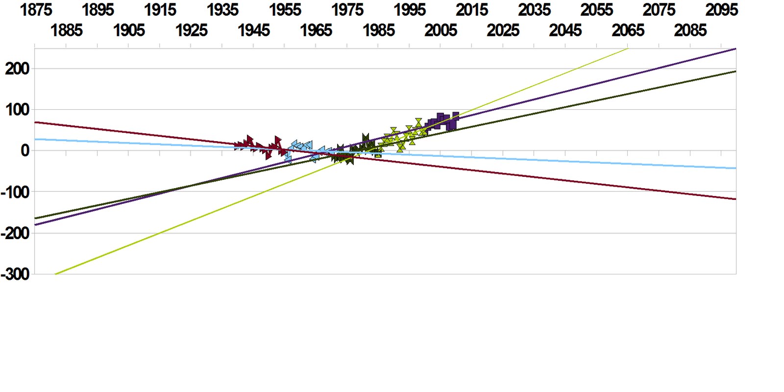
This is a comparison of the 1910 to 1940 slope (Green) with the 1965 to 2010 slope (dark purple) with a trend line for 1995 to 2010 add in yellow. The 1965 to 2010 has a greater slope and the 1995 to 2010 shows a slight increase in the 1965 to 2010 slope. The increase in the slope for the last 15 year period is 0.002 per year. That would add another 0.18 to the warming versus the 1965 to 2010 trend. If each of the next 15 year periods increased the same as 1995 to 2010 did, that would add 0.63 to the final temperature in 2100. Since I am in what if mode and enjoying playing with my spread sheet, another chart.

This is a pretty lame way of doing things, but it is a crude what if chart. I let the Open Office program pick the yellow exponential curve. Open Office is extremely pessimistic of our future. That is basically a runaway greenhouse curve which is extremely unlikely. The green curve is the in the pipeline curve. The light blue curve is the 2.7 climate sensitivity curve roughly. The purple line is the linear regression for the 1965 to 2010. Finally, the dark red curve is approach to zero curve.
The approach to zero curve is unlikely. It roughly estimates what would happen if the current solar reduced activity is able to trigger a new minimum in climate. There have been minimums like the Mauder and Dalton in the past, so maybe. This curve allows for some enhanced Global Warming to smooth the transition zero assumed as the minimum value.
The purple line is in the range I estimate based on my simple linear stuff. The end point of the line is within nearly every estimate of 2100 temperatures. I am pretty confident in the range of 1.3 to 2.1 C by 2100. Since I am using the GISS data, the end point is closer to the upper end of that range.
The light blue line I feel is less likely, but possible. It is based on the possible acceleration in warming of the 1995 to 2010 period in the GISS data versus the 1965 to 2010 trend continues. This just happens to be pretty close to what the new models estimates for the IPCC AR5 report will estimate. There is still a lot of model tweaking going on, but I am fairly confident pretty close to what is published for the next report. Since the modelers are still ignoring natural variability that is pushing the actual to the lower end of their estimates, this is probably close to the upper limit.
The in the pipe line is very unlikely. This roughly approximates acceleration of the warming in the light blue curve. So for this to happen, fourteen years from now we would see a fourth 15 year period with a warming slope of some significance. Some significance is debatable. Nearly anything positive may be significant. If there is no obvious start of a down trend for sixty years, that is fairly unprecedented in our short instrumental period. If the trend of the next 14 years has a slope of more than 1.017, the linear regression slope of 1995 to 2010 GISS data, I would say that would be a game changer.
There is nothing rigorous about this analysis. I think it is interesting. It doesn't really assume anything other than in the what if's. Even there, it gives what looks to be reasonable food for thought, both for modelers and skeptics. The differences in the hemispheres seems to indicated that land use and pollution are about equal in importance to CO2 forcing. While the accuracy of the temperature records and the length of the records are not enough to be confident in, there is a slight indication that there is more negative natural feedback with warming temperatures than typically estimated.
There is a lot of room for improvement, so I may come back to this later. For right now, enjoy picking it apart.
UPDATE: I am having fun with this. Even with this simple temperature range you can bias your results. The 15 year period slopes change if you start at the beginning of series or work back from the end. By doing a 15 year period and progressively adding one year for the next period you can eliminate any bias. That way whether you go front to back or back to front, you have every possible combination. If the series is approaching a value, the animation would show the value range it is honing in on. That is not earth shattering or anything. There are several ways of doing the same thing. The trick is doing it in a way that everyone can "see" the same end results. I look at what I have do so far and "see" the data approaching a range. That doesn't mean that things can't change, just that as of right now it is approaching something. If I attempt to add my limited knowledge of atmospheric physics to interpreting the results, I can miss the natural variations that may be hidden in the noise. If I add my theory of natural variation I can miss some of the physics. From my perspective, the range of the what if chart covers everything except the unexpected, a meteor whacking Earth, volcanic mayhem, or the hurricane season from hell for example. So, until I get bored, I am going to play some more while building the animation. That means there will be a boring post or two on this before I get back to hydrogen.
No comments:
Post a Comment